ELVEE blog

Why real product screenshots matter on app websites

Learn why real product screenshots improve trust, conversions, SEO, and user understanding on app websites more than generic mockups ever can.

ELVEE Design Team2026-03-1010 min read
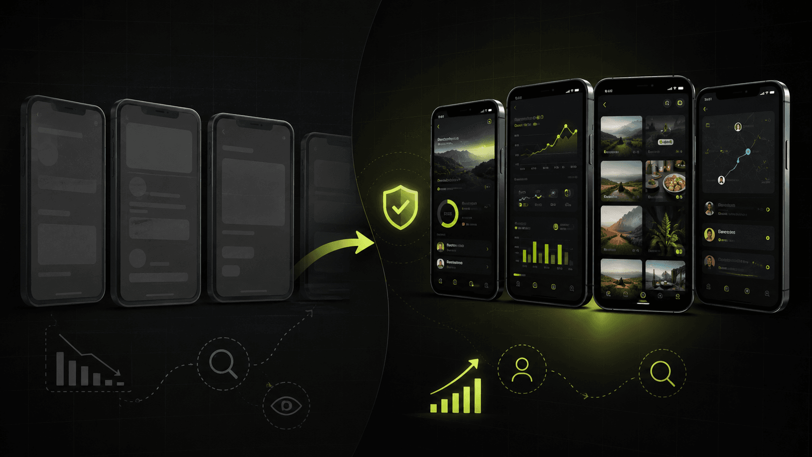
Real mobile app dashboard screenshot shown inside a product website layout with clean UI cards and clear feature context.

Table of contents

Why real product screenshots matter on app websites

When someone lands on an app website, they usually want one simple thing: proof that the product is real and relevant to their problem. Real product screenshots do that faster than almost any other design element.

A headline can make a promise. A feature list can add context. But a screenshot shows the actual interface, the real workflow, and the level of product maturity. That makes the message easier to trust.

This is especially important for mobile apps, SaaS tools, and AI products. Many websites in these categories sound similar. Screenshots help people see the difference instead of guessing what the product might do.

If your site uses abstract graphics, stock devices, or fake placeholder screens, visitors often feel friction right away. They may not say it out loud, but they start wondering whether the app is finished, whether the feature is real, or whether the marketing is stronger than the product.

How screenshots build trust and reduce doubt

Trust on an app website is usually built through small signals, not one giant claim. Real product screenshots are one of those signals because they remove ambiguity.

Instead of asking the visitor to imagine what the product looks like, you let them inspect it for themselves. That makes the experience feel more honest and more grounded.

They make the product feel real

People trust what they can see. A real home screen, a settings view, a workflow step, or a result page immediately shows that the app exists beyond the marketing copy.

This matters even more when the visitor has never heard of your brand before. New visitors are not looking for polished language alone. They are looking for proof.

They answer silent user questions

Visitors often have quiet questions such as: Is this app simple or complicated? Does it look modern? Will it work for someone like me? Does it actually solve the problem in a practical way?

Good screenshots answer those questions before the user needs to hunt through paragraphs of text.

They support credible claims

If a page says an app offers step-by-step tutoring, smart summaries, or detailed analytics, the screenshot should show that kind of interface in action. When copy and visuals match, the whole page becomes more believable.

Tip

If a visitor can understand the product only after reading every word on the page, the visuals are not doing enough work.

Why real screenshots can improve conversions

Screenshots are not just decorative. They can directly support better conversion because they help the right visitor feel confident enough to keep going.

That next step might be downloading the app, opening the App Store page, starting a trial, booking a demo, or reading more product details.

  • They reduce uncertainty before the click.
  • They help users self-qualify quickly.
  • They make feature benefits easier to understand.
  • They can improve the quality of traffic that continues deeper into the funnel.
  • They often lower the gap between expectation and reality after install or signup.

Simple practical example

Imagine two app landing pages with the same headline: one says the app helps users organize research, notes, and AI chat workflows.

The first page uses abstract illustrations. The second shows a real dashboard, saved conversations, organized folders, and a note summary view. The second page usually gives the visitor a clearer reason to trust the promise and click through.

How screenshots support SEO and helpful content

Real product screenshots do not improve Google rankings by themselves in the same way a title tag or internal link might. But they support the wider signals that make a page more useful, and useful pages tend to perform better over time.

Google Helpful Content principles reward pages that genuinely help people complete a task or understand a topic. Screenshots help with that because they make the page clearer and more practical for human readers.

Better screenshots often improve engagement

When visitors understand a page faster, they are more likely to stay, scroll, compare sections, and keep exploring the site. That does not guarantee ranking gains, but it often supports stronger user behavior overall.

They make beginner-friendly content easier to follow

A beginner may not know what terms like dashboard, AI persona, analytics view, or revision planner mean. A screenshot can make those ideas instantly concrete.

They strengthen relevance for product-led searches

If someone searches for the best app for a task, they want to compare real products. Pages that show the actual interface often feel more helpful than pages that only describe features in general language.

What good app website screenshots look like

Not every screenshot is automatically useful. The best ones are selected with the visitor's questions in mind.

  • Use real screens from the current product, not old UI or design concepts.
  • Show the interface at moments that explain value, not random settings pages.
  • Pair each screenshot with a short caption or nearby copy that explains what the visitor is seeing.
  • Keep the layout clean so the screenshot is easy to scan on desktop and mobile.
  • Use multiple screenshots to tell a simple story instead of repeating similar views.

Best places to use them

  • - Hero section to show the main product promise quickly
  • - Feature sections to connect claims with visible proof
  • - Comparison or workflow sections to explain how the app fits into real use
  • - Blog posts and support guides where visuals make instructions easier

What to avoid

  • - Tiny screenshots that are impossible to understand
  • - Heavily blurred screens that hide the product
  • - Mockups filled with fake data that feels unrealistic
  • - Visuals that do not match the current app experience

Practical use cases for real screenshots

The value of screenshots changes slightly depending on the kind of app you are promoting. The core principle stays the same: show the product in a way that helps the visitor imagine using it.

For AI apps

AI products often make big promises. Real screenshots help prove that the experience is structured, usable, and not just a vague chatbot with marketing language around it.

For productivity tools

Task managers, note apps, calendar tools, and dashboards benefit from screenshots that show organization, clarity, and workflow continuity. Users want to know whether the product feels calm or cluttered before they commit.

For educational apps

Parents, students, and teachers often need reassurance that the product is practical and easy to follow. Screenshots of tutors, quiz flows, summaries, and revision tools make that clearer than broad claims alone.

Three screenshot choices that work well

  • - A hero screenshot that shows the main result screen or core dashboard
  • - A feature screenshot that explains one important user action
  • - A support or blog screenshot that helps users follow a real task step by step

Common mistakes teams make with app screenshots

Many teams understand that screenshots matter, but they still use them in a way that weakens the page.

Tip

A slightly imperfect real screen is usually more persuasive than a beautiful fake one.

Common mistakes

  • - Treating screenshots as decoration instead of product proof
  • - Using outdated UI that no longer matches the live app
  • - Showing too many nearly identical screens
  • - Hiding the interface behind dramatic effects or oversized device frames
  • - Forgetting to explain why a screenshot matters to the visitor
  • - Using generic placeholder visuals because the real screens are harder to prepare

FAQ

Why are real product screenshots better than generic mockups?

Real product screenshots show the actual interface, which makes the app feel more trustworthy and easier to understand. Generic mockups may look polished, but they often do less to prove that the product is real and useful.

Do screenshots help SEO on app websites?

Screenshots do not rank a page on their own, but they can make content more helpful, improve clarity, and support stronger user engagement. Those qualities align better with helpful content and can strengthen the overall page experience.

What screenshots should an app landing page include?

A strong app landing page usually includes a hero screenshot of the core experience, supporting screenshots for major features, and visuals that show real workflows or outcomes instead of random interface fragments.

Can polished device mockups still be useful?

Yes. Device mockups can improve presentation, but the screen inside the device should still come from the real product. The mockup should support the screenshot, not replace it.

Conclusion

Real product screenshots matter on app websites because they make the product easier to trust, easier to understand, and easier to choose.

They help visitors move from curiosity to confidence. They also support more helpful content by showing practical proof instead of relying only on claims.

If you want an app website to feel credible, beginner-friendly, and conversion-focused, start by showing the real product clearly.

Suggested internal links

Suggested external references

CTA

Want to see product pages that use real app visuals well?

Explore ELVEE app pages to see how real screenshots, clear feature framing, and practical copy work together on live product experiences.